- OISHI! HIROSHIMA
- DESIGN
- DIGITAL SIGNAGE, ADVERTISEMENT, VISUAL, COPY
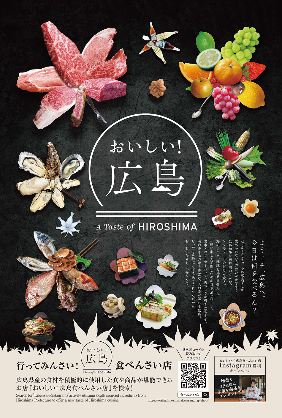
A design creation for an OOH (Out-Of-Home) advertising campaign called "Oishii! Hiroshima", to promote the diverse culinary attractions of Hiroshima both domestically and internationally and to invigorate Hiroshima's food scene. For showcasing the richness of Hiroshima's cuisine to those who see it, the background of the design features an image inspired by the Teppan (iron griddle) used for Okonomiyaki, with Hiroshima-grown ingredients and specialties arranged in the shape of maple leaves, creating an appetizing visual effect. By displaying it at major gateways to Hiroshima, such as JR Hiroshima Station and Hiroshima Airport, those achieved a significant number of impressions.
広島の多彩な食の魅力を国内外に発信し、広島の食のシーンを盛り上げるためのプロジェクト「おいしい!広島」の認知拡大のため、OOHのデザインを制作。お好み焼きの鉄板をイメージした背景に、広島県産の食材や名物を紅葉の形に並べ、シズル感を演出。目に触れた人に広島の食の豊かさを訴求するデザインを制作した。JR広島駅、広島空港など、広島の玄関口となる場所に掲出することで、多くのインプレッションを獲得した。
Producer / Planning AKIHIKO SUZUKI(PMA Inc.)
Director IKUTO WATANABE(PMA Inc.)
Designer HARUNORI UEDA, YUKI MATSUMOTO(AND Design Inc.)